Fossil Fuel Emissions
Terms
| Attribute | Year | Country | Total | Solid Fuel | Liquid Fuel | Gas Fuel |
|---|---|---|---|---|---|---|
| Description | The year for a country's data | The country whose data we are examining | The total amount of fossil fuel emissions | The amount of solid fossil fuel emissions | The amount of liquid fossil fuel emissions | The amount of gas fossil fuel emissions |
Our Designs
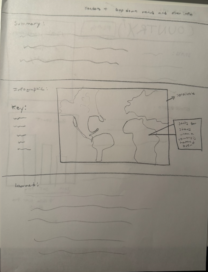
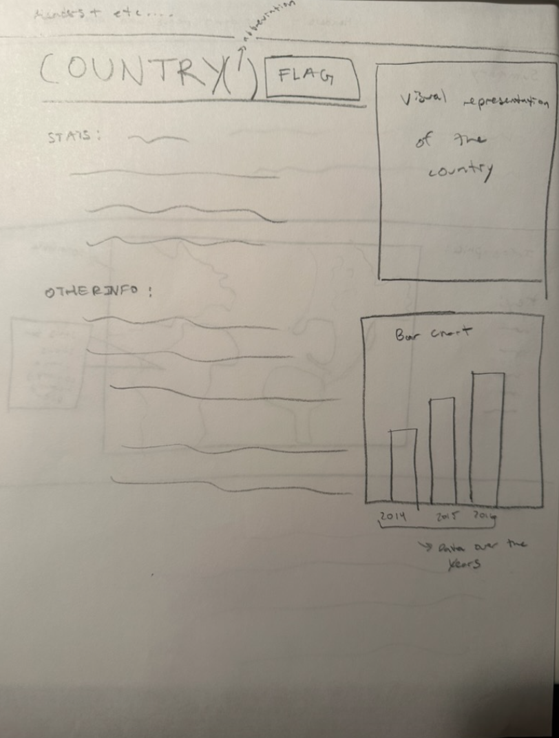
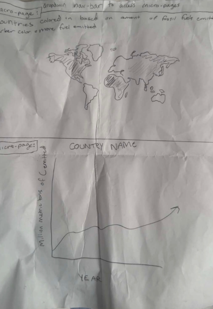
In both James and Varun's designs (Varun: the two on the left; James: the one on the right), their simple, yet well-mapped, systems allow for the user to easily access and comprehend both the macropage and each micropage. Along with this, in both Varun and James' designs, they use dropdown bars to access micropages. These dropdown menus contain examples of both feedback and signifiers, as the dropdown arrows suggest how the menu should be used (signifier), and the tab that drops down after the user clicks on a specific part of the menu gives the user feedback that they clicked the correct spot. In Varun's design specifically, he included a picture of a map, which, when the user hovers their mouse over a specific country, displays the fossil fuel emission statistics for that country. This aspect of Varun's design in particular will be hard to achieve, as neither James nor Varun have ever coded something like that before. Even so, both James and Varun are confident that, if they put their minds together, they can achieve this! Furthermore, in Varun's design, he included a summary of the data at the top of the macropage. This is an example of natural mapping, as the user will understand what the data truly means before they delve into the numbers and statistics, as the summary will likely be the first thing they see and read. In James' design specifically, he included a map colored in based on the amount of fossil fuels emitted by each country (darker colors signify more fossil fuels emitted). This is an example of both visibility and modeling, as the picture of the map, along with the easy-to-understand color key, provides the user with the necessary tools to view the important elements of the design and build their own conceptual model of the system. Overall, James and Varun feel that, while this project certainly delves into many new areas of coding, their teamwork and positive mindsets will allow them to achieve these designs and go above and beyond!
Unified Approach
First off, we plan on using Varun's data summary at the top of our macropage. Below this, we plan on using James' color-coded map. We feel that James' map provides the user with the most comprehensive and in-depth view of our data. We will also use dropdown menus to access micropages, using Varun's micropage design, which we felt contains more information and is very well-organized.
Other Terms for Our Project
Fossil Fuel Emissions: The Amount of CO2 emissions
Parts Per Million: A mesurement used in our project to identify the amount of CO2 emissions per one million parts of air
Metric Tons: Equivalent to 1000 kilograms
Division of Labor
James: Worked on the prebuild.js file, and worked on incorporating the dataset.
Varun: Worked on the about.ejs file and adding the navbar as a funtion.
Both: Worked on the ejs files for each country and the index ejs file. Also worked on aking sure the navbar worked properly for each ejs page. All other components of the project were also worked on by both partners.
Project Pipeline
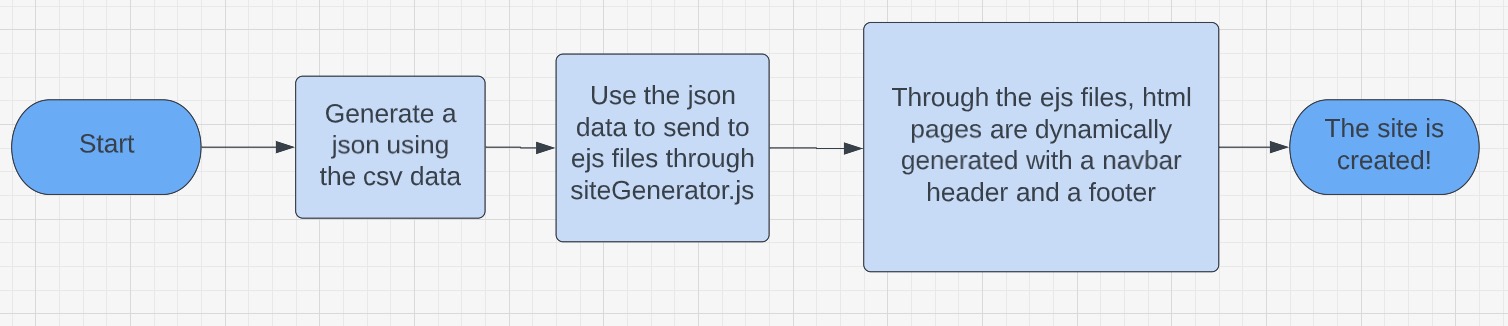
Step 1: We used a downloaded csv file, and through generateJsoncoTwo.js, we convert the csv file to a json file where we take only the values that we want
Step 2: Through the file siteGenerator.js, we send our json file data to the ejs files about.ejs, index.ejs, and country.ejs
Step 3: In our ejs files, we link to other ejs files called navbar.ejs and footer.ejs, allowing us to dynamically insert a navbar and a footer
Step 4: Our website is created and it can be viewed through a browser